

7-Slide Educational Carousel Framework Top Creators Use
If you have ever posted a single-image update on LinkedIn and watched it flatline at three impressions, you are not alone. The feed is crowded. Text posts get skimmed. Single images get scrolled past in under a second. But the educational carousel LinkedIn format is different — it forces the algorithm to pay attention and it forces your reader to stop, swipe, and think.
Top creators on LinkedIn do not guess their way through carousel design. They use a repeatable framework. In this guide, you will learn the exact 7-slide framework that turns one idea into a save-worthy, follow-driving educational carousel — and how to build it in under five minutes even if you have never opened a design tool in your life.
Why Educational Carousels Dominate LinkedIn in 2026
LinkedIn has changed. It is no longer a résumé repository. It is a content platform where creators, founders, and marketers compete for attention the same way they do on Instagram or TikTok. The difference? LinkedIn users are in a learning mindset. They open the app to grow their careers, not just to be entertained. That is why the educational carousel LinkedIn format wins: it meets the user where they are — hungry for actionable insights they can apply immediately.
The Algorithm Loves Dwell Time
LinkedIn's algorithm rewards content that keeps users on the platform longer. A carousel does exactly that. Every swipe is an extra second of dwell time. Every save is a signal that your content is valuable. According to Hootsuite's Social Media Trends Report, carousel posts on LinkedIn generate up to 1.4x more engagement than static image posts because the swipe mechanic creates a natural loop of curiosity and completion.
Saves Are the New Metric
Likes are cheap. Comments are better. But saves are gold. When someone saves your carousel, they are telling LinkedIn — and themselves — that this content is worth coming back to. Saved content gets resurfaced in "Recommended for You" feeds and drives long-tail traffic weeks after you post. The LinkedIn carousel format that prioritizes education over promotion earns more saves because it delivers immediate, referenceable value.
What Is an Educational Carousel and Why It Beats Single-Image Posts
An educational carousel is a multi-slide document — typically 5 to 10 slides — that teaches one clear idea using concise text, visual hierarchy, and narrative structure. Unlike a promotional social media carousel that pushes an offer, an educational carousel gives before it asks.
- More real estate: 5 to 10 slides instead of cramming everything into one graphic.
- Natural storytelling: the swipe mechanic mirrors how we consume stories, one beat at a time.
- Higher perceived value: a carousel looks like a mini course; a single image looks like an ad.
- Better algorithmic distribution: LinkedIn promotes high dwell time and save rates — carousels deliver both.
If your LinkedIn content strategy relies on text-only posts or single images, you are leaving engagement on the table. The carousel is the format that bridges value and virality.
The 7-Slide Educational Carousel LinkedIn Framework
This is the framework. Memorize it. Reuse it. Every top-performing educational carousel follows this arc, whether the creator knows it or not.
Slide 1 — Pattern Interrupt
Your cover slide has one job — stop the scroll. Use a bold statement, a surprising statistic, or a contrarian opinion. The text should be large, high-contrast, and readable on mobile. Do not introduce yourself here. Do not add your logo. Just the hook.
"I spent $0 on ads and grew to 50K followers in 8 months. Here is the exact content system I used."
Slide 2 — The Problem
Name the pain point your audience feels. Make it specific and relatable. This builds empathy and primes the reader to want a solution.
"Most creators post daily and see zero growth because they confuse activity with strategy."
Slide 3 — The Insight
Share the aha moment. This is the pivot point where you reframe the problem. It should feel like a lightbulb turning on.
"The creators who grow fastest do not post more. They post carousels that teach one clear idea per slide."
Slide 4 — The Framework
This is the meat. Present your system, process, or model in a visual, scannable way. Use numbered steps, a simple diagram, or a checklist. Keep text minimal and let the structure do the teaching.
A 4-quadrant diagram showing "Content That Educates" vs. "Content That Promotes" and "High Effort" vs. "Low Effort."
Slide 5 — The Proof
Show, do not just tell. Share a screenshot, a mini case study, or a real result. Proof builds trust and makes the framework feel achievable.
"After switching to this carousel format, my average post impressions went from 1,200 to 14,000 in 30 days."
Slide 6 — The Application
Tell the reader exactly how to apply what they just learned. Make it actionable. One simple next step is enough.
"Pick one idea you explained in a text post last week. Break it into 7 slides using this framework. Post it tomorrow."
Slide 7 — The Call to Action
End with a clear, low-friction CTA. Ask for a save, a follow, or a comment. Do not pitch your product yet — the goal of an educational carousel is to build trust, not to sell.
"Save this for your next post. Follow for more carousel frameworks."
Want the framework pre-built? Open the educational carousel template and Creato lays out all seven slides for you.
Educational Carousel Design Tips That Keep Readers Swiping
A great framework means nothing if your slides look like a PowerPoint from 2003. These carousel design tips keep your audience locked in from slide one to slide seven.
One Idea Per Slide
This is non-negotiable. If a slide contains two ideas, split it. The brain processes visual information in chunks. One idea per slide creates rhythm and makes your carousel feel effortless to consume.
Use High-Contrast Visuals
LinkedIn's feed background is white. Your slides should pop. Use dark backgrounds with light text, or vice versa. Stick to two brand colors max. If you have not set your brand colors yet, set up your brand kit in Creato so every carousel stays consistent.
End Every Slide With a Curiosity Gap
The last line of every slide — except the final one — should create an open loop. Make the reader need to see what comes next.
How to Create an Educational Carousel in Under 5 Minutes
You do not need Canva. You do not need Photoshop. You do not even need to know what kerning means. Here is the fastest way to go from idea to published educational carousel LinkedIn post.
- 1Define your one big idea
Pick one insight, lesson, or framework you have explained before. Narrow it down until you can describe it in a single sentence. If it takes more than one sentence, it is too broad.
- 2Outline using the 7-slide framework
Map your idea to the seven slides above. Spend two minutes on this. Do not overthink it — the framework is designed to do the heavy lifting.
- 3Generate visuals with an AI carousel generator
Open an AI carousel generator, enter your topic, select the Educational format, and let the tool build your slides. The AI handles layout, typography, and visual hierarchy. You just review and tweak.
- 4Apply your brand kit
Before you export, make sure your colors, fonts, and tone match your identity. If you have already filled out your My Identity profile, the AI applies your brand settings automatically.
- 5Export and schedule
Export your carousel as a PDF or image sequence. Upload it to LinkedIn at your optimal posting time. Add a short caption that restates the hook and includes a CTA. Hit publish.
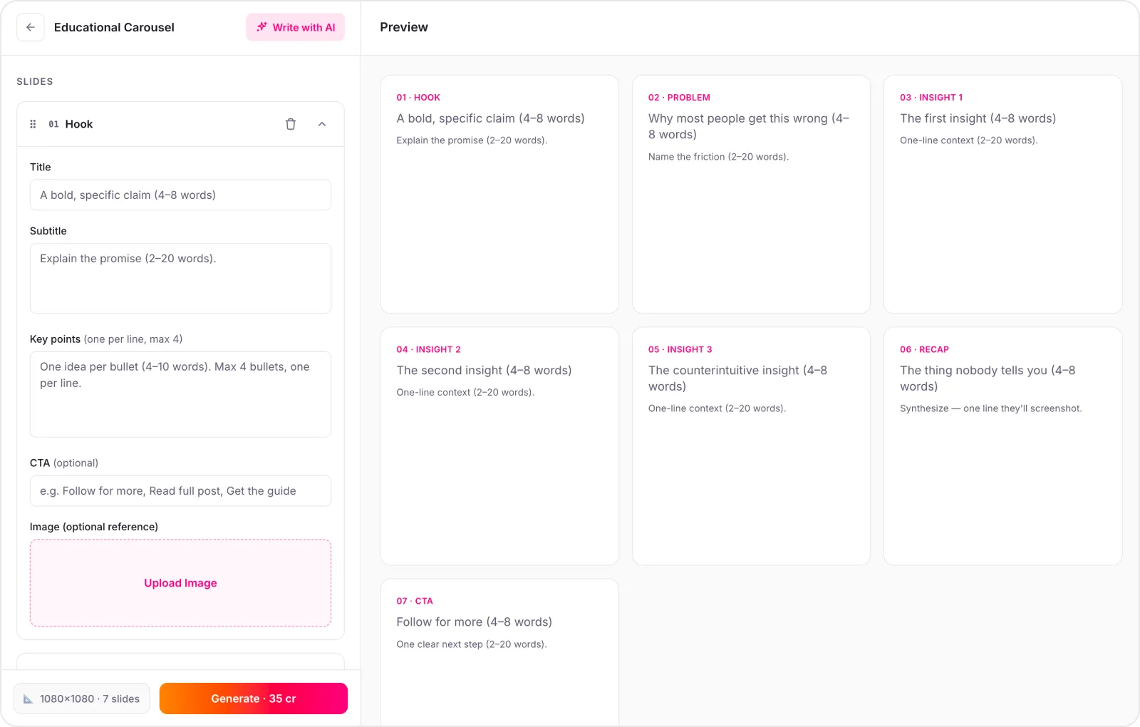
Total time: under five minutes. Total impact: a save-worthy, follow-driving asset that works while you sleep. Try it with the AI carousel generator — it is free to start.
Common Mistakes to Avoid
Even good creators sabotage their carousels. Watch out for these:
Too many slides
Ten is the ceiling. Seven is the sweet spot. Every extra slide is a drop-off risk.
Wall-of-text slides
If a slide has more than thirty words, cut it in half. Carousels are visual, not essays.
Forgetting the cover slide
The first slide is your ad for the rest of the carousel. Spend 50% of your design energy here.
No CTA on the final slide
If you do not tell the reader what to do next, they will do nothing.
Inconsistent branding
Random colors and fonts make you look amateur. Use a brand kit to stay consistent.
Frequently Asked Questions
How many slides should an educational carousel have?+
The optimal educational carousel LinkedIn format uses 5 to 10 slides. Our 7-slide framework balances depth with attention span, giving you enough room to teach one clear idea without losing the reader before the final slide.
What is the best size for a LinkedIn carousel?+
LinkedIn recommends 1080 x 1350 pixels (4:5 aspect ratio) for carousel slides. This vertical format takes up maximum real estate in the mobile feed and encourages more swipes.
Should I use AI to create educational carousels?+
Yes. An AI carousel generator can turn a single idea into a fully designed LinkedIn carousel in under 5 minutes, complete with on-brand visuals, structured copy, and consistent formatting — no design skill needed.
How do I make my carousel stand out in the LinkedIn feed?+
Use a bold pattern-interrupt on the cover slide, high-contrast colors from your brand kit, one idea per slide, and a curiosity gap at the end of each slide that forces the reader to swipe.
Can I schedule carousels directly to LinkedIn?+
LinkedIn does not support native carousel scheduling for personal profiles. Most creators design their carousel, download it as a PDF or image sequence, and upload it manually at their optimal posting time.
Conclusion
The educational carousel LinkedIn format is not a trend. It is a structural advantage. It gives you more space to teach, more opportunities to hook, and more reasons for your audience to save and follow. The creators who win on LinkedIn in 2026 are not the ones posting the most — they are the ones posting the most valuable content in the most consumable format.
You now have the 7-slide framework they use. You have the design rules that keep readers swiping. And you have a five-minute workflow that removes every excuse.
Your next step is simple: pick one idea, open the framework, and build your first carousel today.
Start Creating Visuals That
Drive Results Today
Try Creato today. No templates that look like everyone else. No hours lost to Design. Just content that sounds and looks like you.